With sharp moves lower in equities in the past two weeks, the market psychology of the past 18 months has clearly broken. Not only that, but the break has been relatively unnerving and severe. A tweet this morning by ‘SentimenTrader’, for example, stated that, since 1897, this is the 4th fastest decline into ‘correction’ territory for the Dow from an all-time high (see HERE for tweet). Our quick and dirty analysis shows that this is the first time ever that the S&P has corrected by more than 10% from an all-time high within just two weeks1 (and, for the Dow, the first time since 1928).
Naturally the key question therefore is whether this pullback will evolve into something more sinister (i.e. how large will the correction be & how long will it last?). And, as a subset of that, how should investors time re-entry into OW equity positions (we moved neutral equities on January 17th, having been OW for most of the past 12 months, see HERE for detail).
Perhaps the best parallels to this pullback are those of 2011 & 2015 (as we laid out earlier this week, see HERE for detail). Both pullbacks occurred against a relatively benign US macro backdrop. The 2011 correction was unsurprisingly larger (and associated with the EZ crisis) whilst the 2015 pullback was smaller (and associated with the RMB devaluation). Today, there are clearly some concerns regarding inflation, bond yields & Fed/central bank tightening (see below). In the main, though, the US (& global) macro backdrop is especially positive, with strong earnings growth, loose monetary policy and a (cyclically) healthy US corporate sector. In that respect, this current correction is probably relatively well advanced (below we map this pullback against those of 2011/2015, see FIG 1).
Fig 1: Recent S&P500 corrections (July 2011 & Aug 2015) vs. current correction
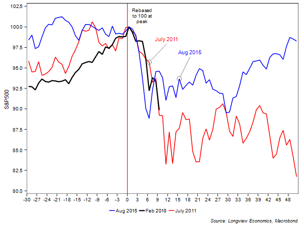
1NB the 2011 high was 11 trading days before the SELL-off began whilst the August ’15 high was 20 days before the SELL-off began
While that type of analysis provides the broad brush strokes, it’s the positioning of our models which will be key in judging a re-entry point into LONG equity positions (i.e. given that no two pullbacks are the same). At this juncture, though, and while a number of medium term (1 – 4 month) indicators have moved to extreme levels, there’s not yet a clear and across the board BUY message from the models.
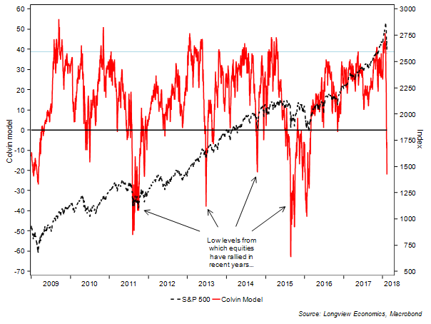
Some (mostly priced based) indicators are on/close to BUY (i.e. technical & breadth models – see FIGs 2 & 3 below)…
FIG 2: Longview medium term technical scoring system vs. S&P500
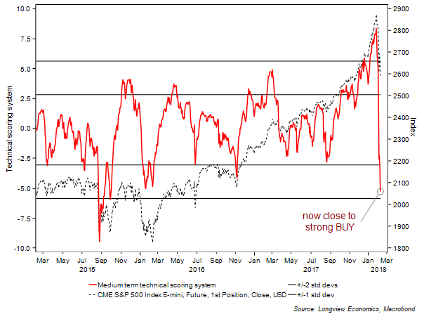
FIG 3: Colvin model (a measure of the breadth of the advance across global risk assets) vs. S&P500
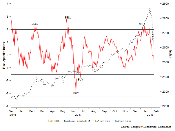
…Other models, though, are yet to reach their BUY thresholds. Our medium term risk appetite indicators, for example, are yet to turn BUY (e.g. see medium term RAG1 below)…
FIG 4: Medium term RAG1 vs. S&P500
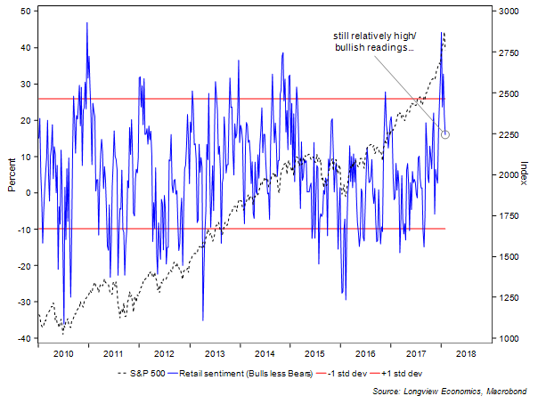
….while sentiment has only just begun to move lower from high/extreme (i.e. overly bullish) levels…(albeit the latest data doesn’t reflect this week’s equity market move)…
FIG 4a: AAII retail sentiment vs. S&P500
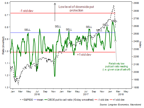
….and there’s (still) a lack of downside put protection in place in portfolios…(suggesting that market participants, on a medium term basis, are not overly fearful)….
FIG 5: CBOE put to call model (10 day moving average)
Arguably that’s consistent with the lack of cross-asset participation in this SELL-off. Currency volatility, for example, has remained subdued (FIG 6); credit spreads have remained relatively tight and a number of key commodity prices (e.g. oil & copper) have held up reasonably well. Reflecting that, our global realised volatility model has not spiked to high/extreme levels (i.e. as it did in the summers of 2011 & 2015).
FIG 6: Global average realised volatility (%, shown with key moving averages)
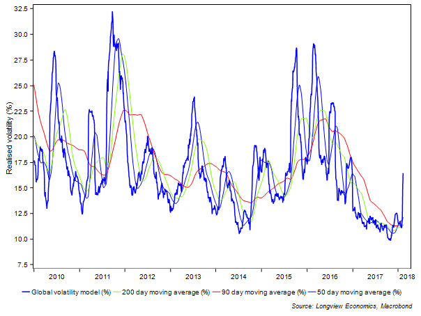
FIG 7: Average implied currency volatility indicator*
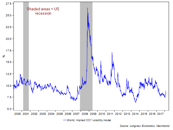
*This currency volatility model calculates the (equally weighted) average implied volatility across 33 major global currencies.
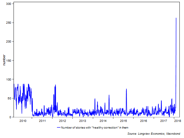
In addition, and despite the (already large) size of the equity market pullback – there’s a distinct lack of anecdotal evidence of fear/stress in markets. The number of times that the words ‘healthy correction’ have appeared in news articles has been relatively frequent in recent days – i.e. highlighting confidence/complacency that this pullback will be fairly run-of-the-mill). See FIG 8.
FIG 8: Number of times that healthy correction has been mentioned in news stories (sum of the last 5 days)
Inflation – how worried should we be?
Rising inflation fears sit at the heart of this recent equity (and bond) market panic. Those fears were no doubt aided & abetted by last week’s strong wage inflation data and are tied to broader concerns about the withdrawal of monetary largesse by the Fed (and other central banks). A possible outcome (albeit unlikely in our view) is that the recent/rapid back-up in bond yields creates a scenario similar to the late 1960s or to 1987 (in which high/rising bond yields result in significant equity market weakness – as we show in FIG 9 below).
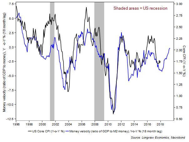
Indeed, key leading indicators of inflation (such as FIG 10 below) suggest that core CPI readings should pick-up over the course of the next 18 months (possibly to around 2%). There may also be some stronger US goods inflation given the weak USD and stronger Y-o-Y oil prices. It’s hard to believe, though, that all that results in a bout of somewhat pernicious inflation (akin to the experiences of the 1960s/1987).
FIG 9: S&P500 vs. US 10 year bond yields (inverted): From 1963 – 1971
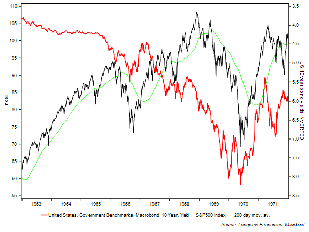
FIG 10: US money velocity (Y-o-Y, % - lagged by 18 months) vs. Core CPI inflation (Y-o-Y %)
How quickly wage growth accelerates is arguably more of a wild card** (and has proven to be unpredictable for most economists/market participants in the past decade). It’s also, though, one of the most important factors in determining the longevity of this economic cycle (and equity bull market).
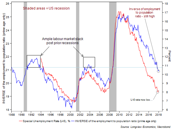
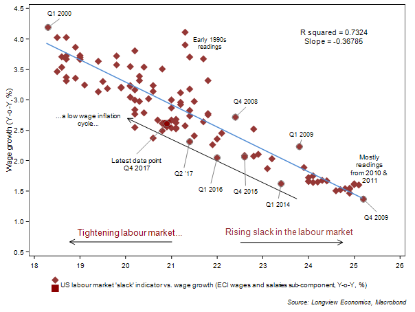
The key to explaining weak wage growth this past decade, and judging how quickly it’s likely to accelerate, is to look beyond traditional labour market indicators, which have not properly measured actual levels of labour market slack. Examining employment to population ratios offers a more complete analysis – which shows that there’s still a relatively large level of slack in the US (as we show in FIG 11 below). While wage inflation is therefore likely to be trending higher over the next 12 – 18 months, it’s unlikely to be a rapid or disruptive acceleration (see HERE for a detailed analysis of US & DM labour markets).
FIG 11: INVERSE of the employment to population ratio (prime age: 25-54) vs. U-6 rate (%)
**as is, in some ways, the impact of the Trump tax cuts.
Of interest, and as we show below, the (inverse of) the employment to population ratio has retained its relationship with wage growth (i.e. the Phillips Curve concept has not broken, but simply needs to be adjusted to capture workers who stopped looking for work, FIG 12).
FIG 12: INVERSE of employment to population ratio vs. wage growth (Y-o-Y %)***
***For prime aged workers only (i.e. those aged 25 – 54) we have used ECI “wages & salaries” for US wage data which is similar, but less volatile, than the headline establishment survey readings
The UK – Limping Towards a recession
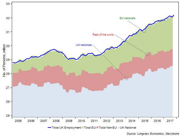
Relatively large levels of slack are also found in other Western labour markets (albeit the sources of that slack are varied). In the UK, slack mainly reflects the rapid inflow of European workers, which has accelerated since the Euro zone crisis. Indeed, since 2011, non-UK nationals have accounted for 36% of the increase in UK employment (even though their share of the total employment market is small, i.e. just 8% of employment in 2011), see FIG 13 below.
FIG 13: UK employment by nationality (UK vs. non-UK national), million
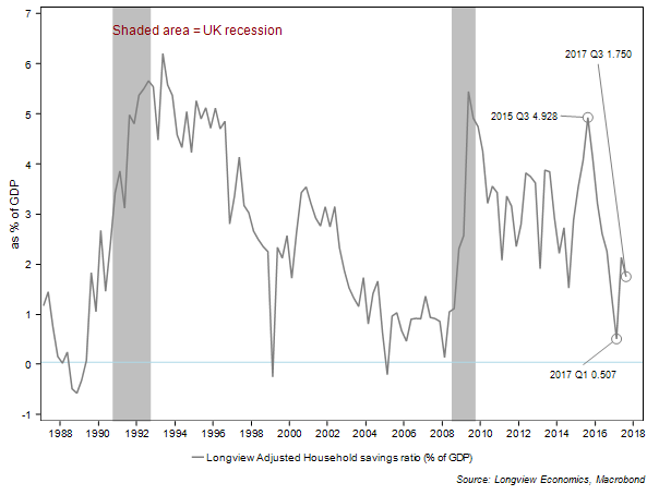
That’s likely to explain the lack of UK wage growth (as well as a number of other factors, which we lay out HERE). Poor wage growth, coupled with high levels of imported inflation in the past 12 – 18 months, has resulted in a real income squeeze and, with that, a relatively sharp fall in the UK household savings ratio. Below we show our adjusted (correctly measured) version of the ratio (which adjusts for a number of imputed/accounting items), see FIG 14.
Historically, once the savings ratio reaches that level, UK recessions or marked economic slowdowns, have typically ensued. Carney’s relatively hawkish comments this week are instructive in that respect and come at a time when the economy is relatively vulnerable. Key vulnerabilities are examined in detail HERE, but include a softening of house price growth (and general housing market activity); a tightening of credit conditions; slowing credit growth and a relatively poor outlook for real household disposable cash flow growth.
FIG 14: UK Household savings ratio – Longview adjusted version (as % of GDP)
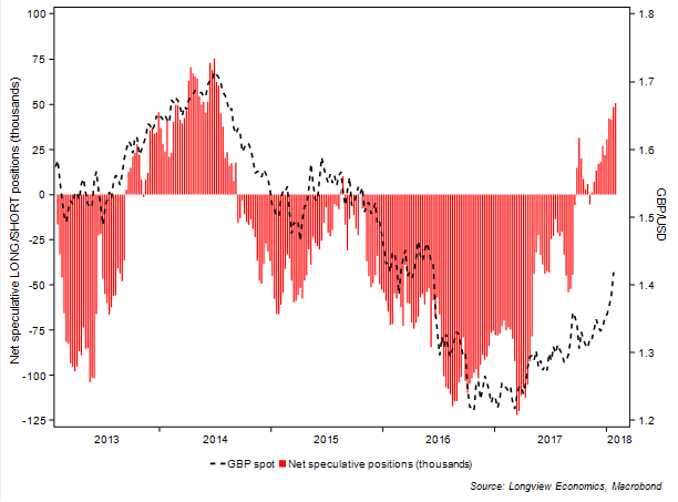
It’s worth noting, given that backdrop, that sentiment towards the GBP is at multi-year highs – as is net speculative LONG positioning (see FIG 15 below).
FIG 15: GBP-USD vs. net speculative LONG/SHORT positions
Longview Research recently published
This week:
Macro Trade Update, 8th February 2018:
"Halve WTI SHORT position" – available HERE
Macro Trade Recommendation No. 87, 6th February 2018:
"Move SHORT Fed funds futures" – available HERE
Longview 'Tactical' Alert, 6th February 2018:
"Equities – Price Action Post a Crash" – available HERE
Tactical Equity Asset Allocation No. 169, 5th February 2018:
"Stay Cautious (for now)" – available HERE
Weekly Market Positioning Update, 5th February 2018:
"Bullishness on WTI increased (new record high)"
Last week:
Longview Letter No. 112, 1st February 2018:
“UK: Limping Towards a Recession?
a.k.a. Factors to Watch” – available HERE
Weekly Market Positioning Update, 29th January 2018:
"USD SHORTs keep building"